How We Re-Imagined a Prototype for the Federal Background Investigation Process by Putting Content First

The Defense Digital Service (DDS) had done extensive investigative work mapping the end-to-end process flow and gathering stakeholders, users and potential data sources to evaluate the viability of moving forward with the System for Automated Background Evaluation and Review (SABER) prototype. DDS determined that it was technically feasible, and in July 2019 our team was tasked with reimagining how background investigation process for security clearances might work better. At the time we started the contract last July, investigations were taking an average of 3-5 months to complete, with a backlog of over 400,000 cases waiting to be started, and 50,000 new requests for investigations pouring in every single week.
Background
The first step was to gain an understanding of the existing process. At a high level, there were three main stages:
A background investigation was initiated when an application came in.
Then, an investigation into the applicant was conducted and a report of the findings was compiled.
Finally, that report was sent to an adjudicator and a decision was made about whether or not the applicant should be granted eligibility for a security clearance.
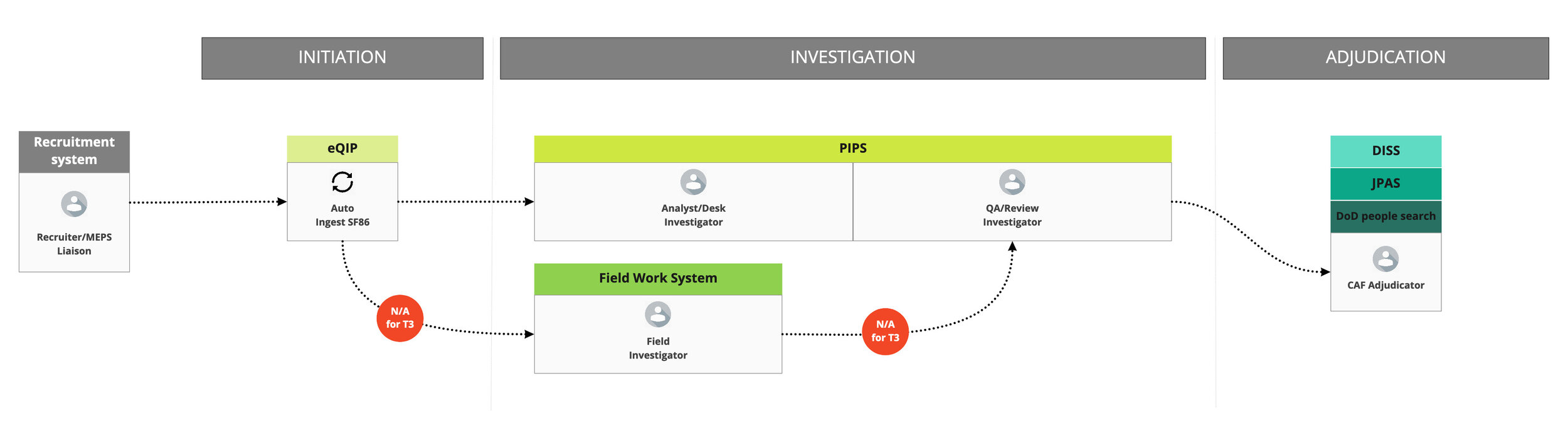
Existing process flow and systems
We had a six-week discovery period which was anchored by two trips to speak with dozens of users and stakeholders across several different organizations. After countless workshops and design exercises to synthesize what we learned, we surfaced the following insights about the process as a whole:
Information is captured multiple times and housed in a number of different systems
There is no single source of truth
It is too manual and too slow
There is too much reliance on paper
There are conflicting goals between investigators and adjudicators
The adjudicator workflow relies too much on muscle memory
There’s no visibility into the process
We couldn’t solve them all in nine months, but knew that in order to speed up the process and reduce the backlog, we’d have to focus our efforts on the issues that were really at the root of that problem: multiple systems, manual processes, and no single source of truth.
Where we placed our bets
To address these issues, we focused on three goals for the prototype:
Creating a single system that would house the full process, from investigation through to an adjudicative decision
Automating some of the manual information retrieval done during the investigation phase
And the one the rest of this article will focus on: Replacing the 50-400 page PDF Report of Investigation (ROI) with an interface that both investigators and adjudicators could use to view input from the applicant side-by-side with information gathered over the course of the investigation
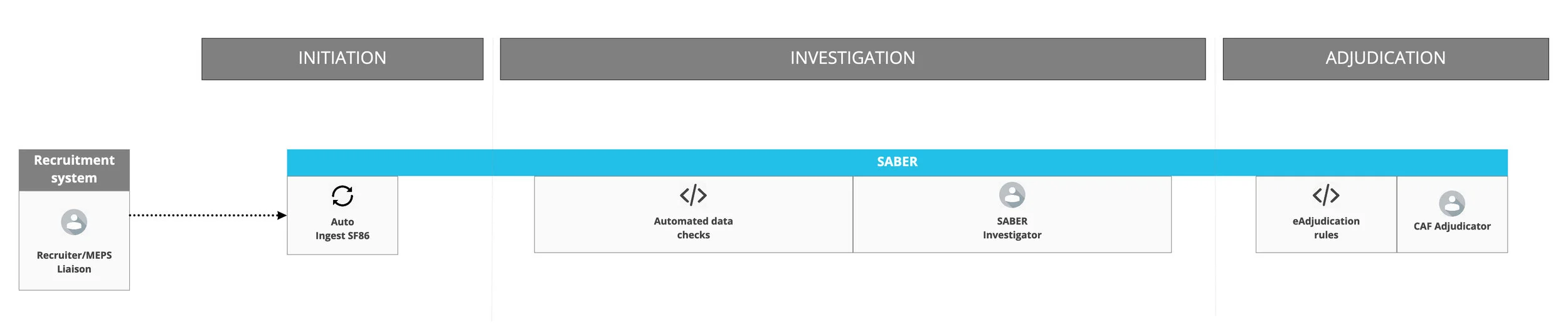
Our re-imagined process flow
The road to our prototype was paved with content
With the direction set, the natural next step would have been to start sketching ideas, running design studios, and wireframing potential solutions. But we started somewhere else first — the content itself. We seeded two documents with user scenarios from both investigator and adjudicator perspectives, which became the foundation for everything else that came after.
For each of these scenarios, we listed the content that would be required for the user to complete the task. You’ll notice that we didn’t prescribe any visual design elements at the time — that was on purpose. We were focused on the task that needed to be done and the information that was necessary to do it.
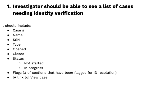
One scenario from our content doc for investigators
Listing out the content for some user scenarios (like above) was pretty straightforward. For others, we did rounds of card sorts and feedback sessions with the client and stakeholders before we were ready to put anything into our scenario documents.
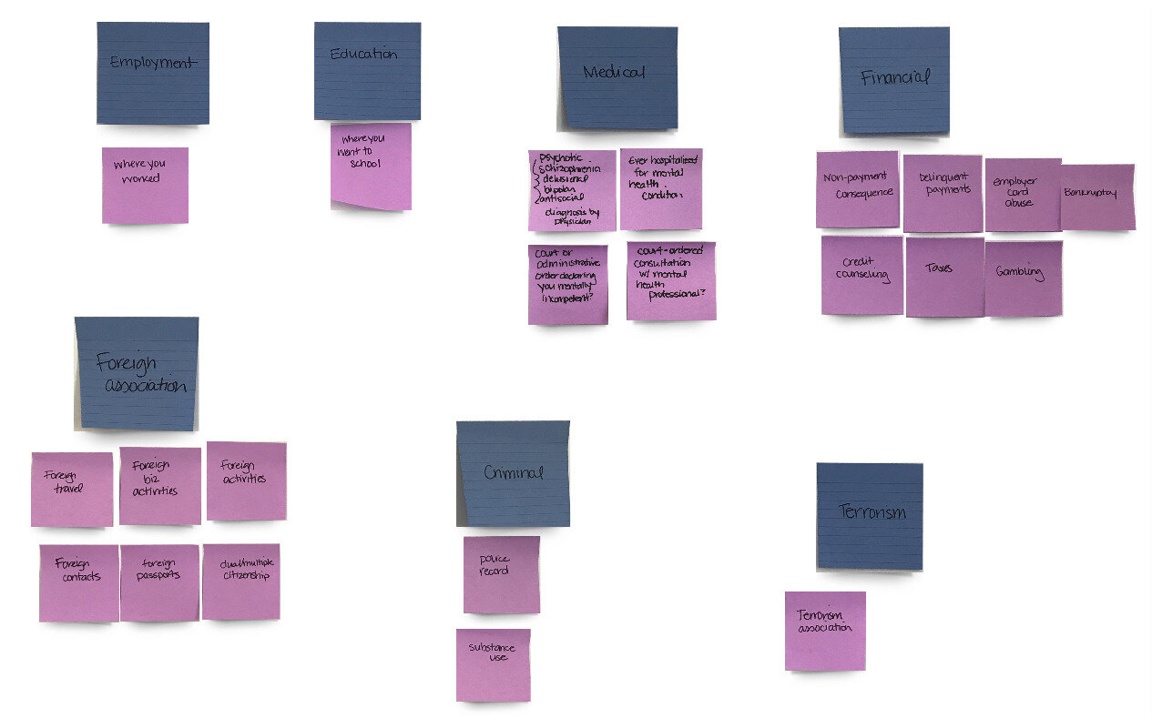
One of many, many card sorts to help us organize case structure
Getting feedback at this stage was as simple as forwarding a Google Doc to someone via email, sharing it over a video call, or taping it to a wall and asking for thoughts. This allowed them to focus on the content itself, without getting distracted by the UI. It also meant we could make improvements instantly with little effort, and could change directions (which we did — more than once) without having to completely tear a Sketch file apart.
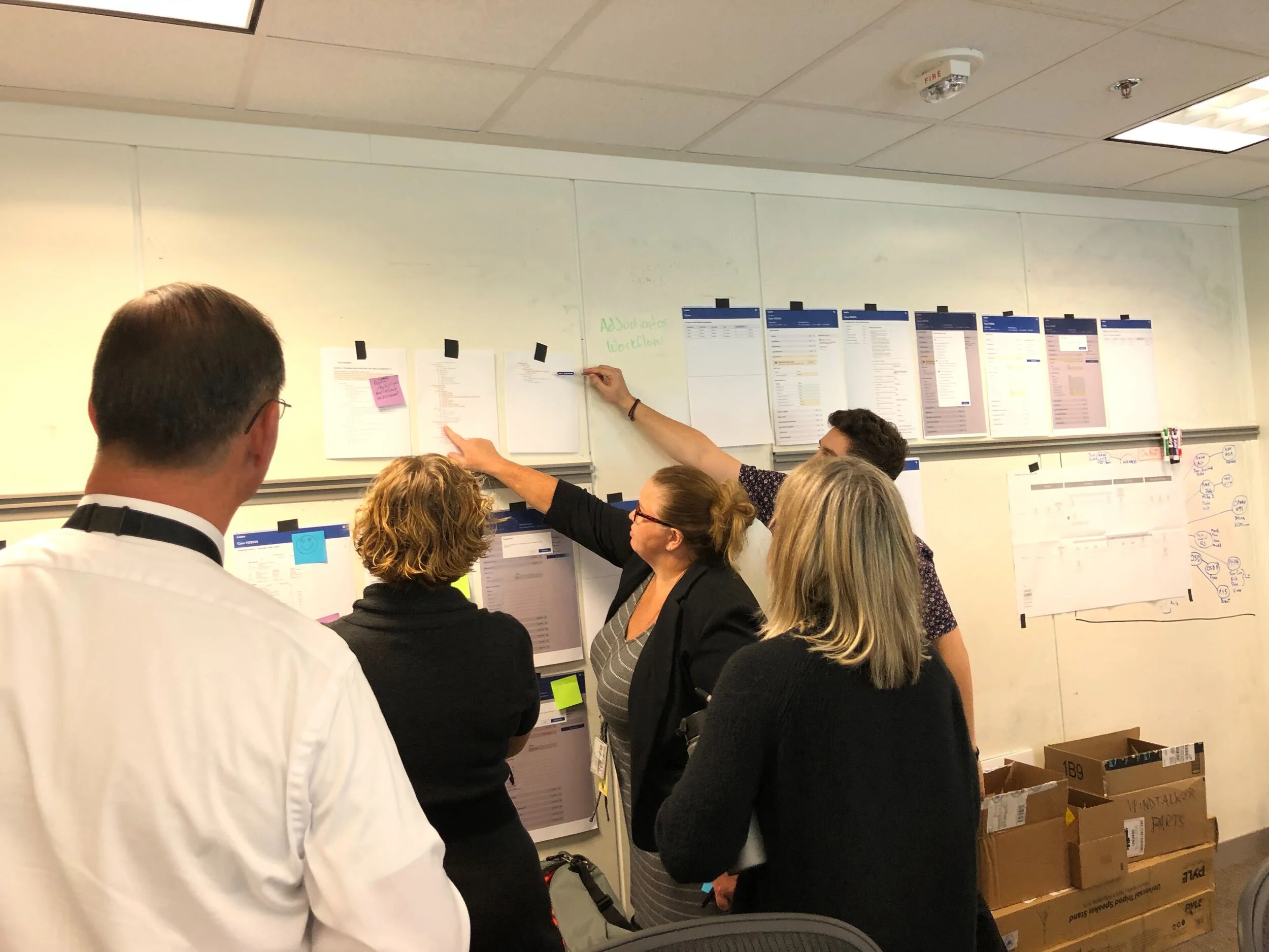
Stakeholders giving us feedback on case structure and organization
After putting these high-level information architecture documents to the test, and agreeing as a team on the workflows, we could then focus on translating that into the UI. Starting this design work after building out basic content architecture was very successful. It gave us the freedom to focus on layout and interaction, knowing that we had already made some content decisions that could be plugged in.

Some of our first wire frames in Sketch
These weren’t just useful artifacts for our design team; they were also passed along to our front-end engineers to ensure they fully understood the information architecture and content dependencies. Whenever something changed — from usability testing or otherwise learning new information — we went back to these content docs to ensure they were up to date. They were a steady source of truth when the interface was in flux, and the resource we continually went back to if we had a question about something.
Top takeaways
This was the first time a design team at Truss had tried this approach on a client project. Here are some of our top takeaways:

Many brains were better than one. This wasn’t just the “content person’s” job to complete in a silo — it was everyone’s. Working through this as a team of four allowed us to catch each other’s assumptions, ask questions, and pressure test ideas internally before taking it out for client and stakeholder feedback.
There was value in creating the lowest fidelity artifact possible to get feedback from end users. We didn’t need things to be in the UI in order to get their thoughts. In fact, getting feedback without the UI allowed us to focus on the content that is most valuable to users without them getting distracted by all the visual elements.
Having high-level information architecture and content decisions locked down first made decision-making for the UI much easier. There was a shared understanding to work from that still allowed for flexibility around different approaches.
Ultimately, this approach allowed us to explore the solution from different but complementary perspectives, collaborate and get feedback earlier in the process, minimize the number of sweeping UI changes, and teach each other a thing or two along the way.
Shoutout to Carmen Bocanegra and Josh Franklin for being my co-pilots in this work and contributing to this post.