USWDS Figma library

For designers in the civic tech space, the United States Web Design System (USWDS) has become a familiar friend. It’s our first stop in choosing components, typography, color palettes, and layout patterns for federal technology projects.
At Truss we use a suite of design tools when working through the design and research process, such as: Sketch, InVision, Miro, and most recently Figma. We’ve quickly adopted Figma for its collaborative design approach, rapid prototyping, and ability to share files quickly with users across different operating systems.
USWDS currently offers its design files for two major platforms, Sketch and Adobe XD. We took some time to convert the design system for use in Figma (using Maya Benari’s version as the starting point) and wanted to share it with the wider design community. The file includes Figma components and styles for all of the current USWDS 2.0 assets.
How to get started
After duplicating the USWDS Figma library you’ll have your own copy of the file to use within a new or existing project. There are two options for how to get started:
Use the USWDS Figma library file as your new project file
Copy and paste the desired components from the USWDS Figma library file into an existing project file (Note: this will not bring along the color and text styles).
Using components
Each component can be found on the assets tab at the top of the layers list. Components are organized by type alphabetically.

Once you have created a new page within the file for your design you can drag and drop each of the components onto the page from the assets list.
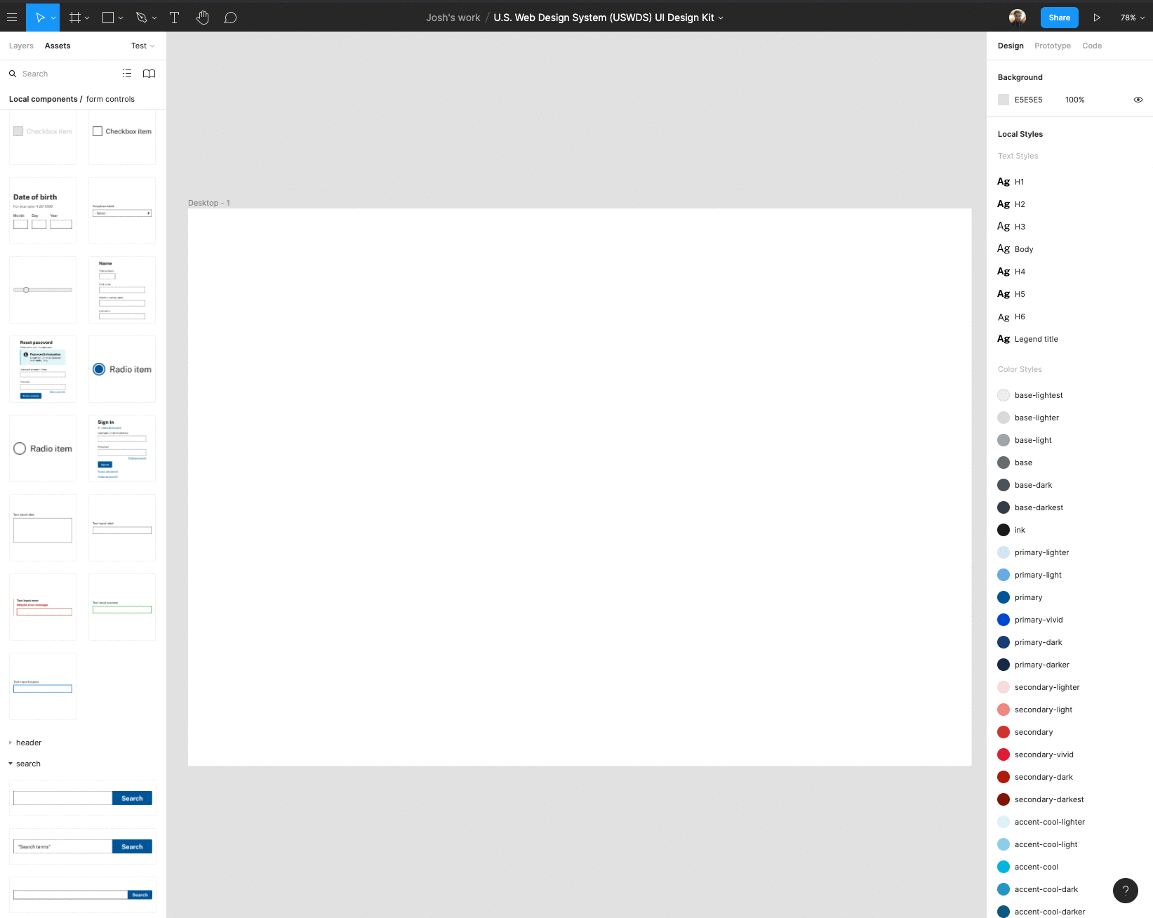
For more details on how to use components check out Figma’s component walkthrough.
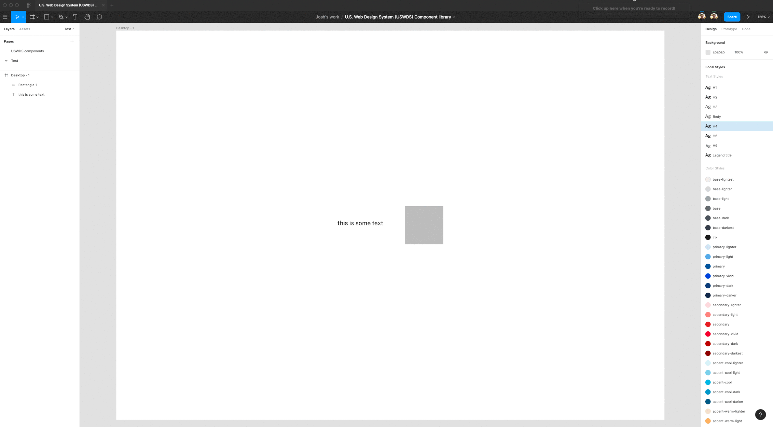
Using styles
In addition to components, the USWDS Figma library also contains reusable color and text styles. These styles can be applied to objects and typography within your designs. USWDS has a wide array of possible color and typography options, this file contains only the base color palettes and one set of typography styles (h1-h6 and body).
You can access the color and text styles from within the properties panel. With an object or text selected, clicking on the styles button will give you access to the files global styles (color or text).